Tips for Choosing Calm Colors for Your Home
Creating a calm and peaceful atmosphere in your home is often about more than just furniture and layout. One of the most impactful elements that can set the tone of any room is color. Choosing calm colors can transform your space into a soothing retreat where you can relax and recharge. But with so many shades and hues available, how do you pick the right ones? In this post, we’ll guide you through practical tips for selecting calm colors that enhance your home’s tranquility.
Why Choose Calm Colors?
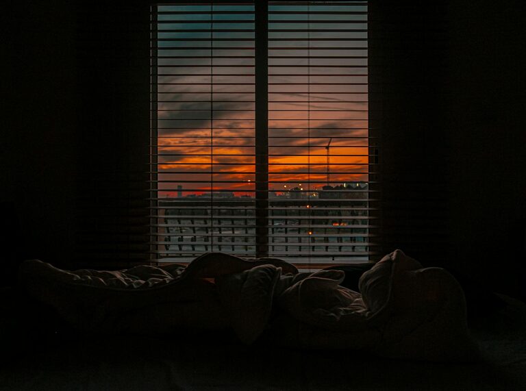
Calm colors tend to have a relaxing effect on both the mind and body. They help reduce stress, promote better sleep, and foster a sense of balance. Unlike bright or intense colors, calm shades create a space that feels welcoming without overwhelming the senses. This makes them a popular choice for bedrooms, living rooms, and areas meant for relaxation and reflection.
Understanding What Makes a Color “Calm”
Calm colors are typically soft, muted, and low in saturation. They often include:
– Pastel tones: Light pinks, blues, greens, and lavenders.
– Neutrals: Beige, taupe, cream, and soft grays.
– Earthy shades: Sage green, soft browns, and gentle blues.
These colors mimic elements of nature, like the sky, water, or soft earth, which naturally evoke a sense of calm.
Tips for Choosing Calm Colors for Your Home
1. Consider the Room’s Purpose
Start by thinking about how you use the room. For example:
– Bedroom: Soft blues or gentle greens can promote relaxation and sleep.
– Living Room: Warm neutrals or muted pastels encourage conversation and comfort.
– Study/Home Office: Light blues or soft grays can enhance focus without feeling sterile.
Matching color choices to room function supports the mood you want to cultivate.
2. Test Colors with Natural and Artificial Lighting
Colors can look very different under various lighting conditions. Always test your paint samples on the walls and observe them at different times of day:
– Morning light tends to be cool and bright.
– Afternoon light is warm and intense.
– Artificial lighting varies depending on bulbs.
This helps ensure your chosen color feels calm regardless of lighting changes.
3. Use a Color Palette for Balance
A well-balanced color palette usually includes:
– Primary calm color: The dominant hue used on walls or large surfaces.
– Secondary complimentary: Softer shades that complement the primary color in furniture or textiles.
– Accent colors: Small pops of calm tones for variety, like muted coral or soft lavender.
Using multiple calm colors together adds depth and interest without sacrificing tranquility.
4. Think Beyond Walls
Calm colors don’t have to be limited to paint. Consider integrating calm hues in:
– Furniture upholstery
– Curtains and rugs
– Artwork and decorative cushions
This approach offers flexibility and makes it easier to refresh your space over time.
5. Avoid Overly Dark or Overly Bright Colors
While dark colors can be cozy, they may also feel heavy, especially in small spaces. Similarly, bright or neon colors tend to energize rather than calm. Aim for soft, light, or medium shades rather than extremes to maintain a soothing environment.
6. Use Matte or Satin Finishes
The finish of your paint can influence how colors appear. Matte and satin finishes tend to absorb light and add a soft touch, reinforcing a calm vibe. Glossy finishes reflect more light and can be more stimulating, so they’re better suited for smaller accents rather than whole walls.
7. Incorporate Natural Elements
Pair calm colors with natural textures such as wood, stone, or woven materials. This combination enhances the peaceful feeling by linking your interior to the calming rhythms of nature.
Popular Calm Color Choices
Here are a few calm colors that work well in homes:
– Soft Blue: Often associated with the sky and water, blue is known for its soothing effects.
– Light Gray: A neutral choice that balances warmth and coolness.
– Sage Green: Earthy and muted, perfect for adding subtle color.
– Warm Beige: Creates a cozy, inviting atmosphere without overwhelming the senses.
– Lavender: Gentle and calming, lavender adds a soft touch of color.
Final Thoughts
Selecting calm colors for your home is all about creating harmony between your personal tastes, the function of your space, and natural influences. Taking your time to test samples, consider lighting, and layer different hues ensures your home will feel like the peaceful retreat you deserve. Remember, calmness in color goes beyond paint — it extends into your choices for accessories, textures, and finishes. With these tips in hand, you’re ready to make thoughtful decisions that bring serenity to every room.
—
Need help choosing the perfect calm colors for your home? Start with a small project like repainting one wall or adding new soft furnishings to see how these serene shades can transform your space. Enjoy the process and the peace that follows!